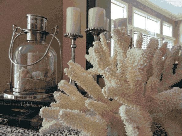
In a world where anyone can find a plethora of accessories for their home, it is important to understanding the keys to accessorizing. Care and restraint should be applied. applied.
We abide by the rule “Less is More” [Ludwig Mies van der Rohe]. Mies also said, “God is in the details”.
He was right on the money!
It is a fine balance to create the right aesthetically pleasing room with accessories. Too little, and the room will be bland. Too much, and the room looks overstuffed and chaotic. Accessories are the ‘jewelry’ of a room. This is an area where an experienced Interior Designer’s help is of utmost importance.
Following are a few key pointers –
Artwork
This is an area that really takes the feeling from ordinary to WOW.
Artwork does not have to perfectly color match to your decor.
Sometimes a very interesting piece that is unexpected in subject and color can really energize a space.
We find that large artwork is very dramatic. When using large artwork, you do not need a lot on the other walls. That dominating piece will create the mood and energy for the space. Smaller artwork is more of a challenge.
There are times that a single, small, well-appointed piece will work on a large wall. This can create an unexpected pleasing result. Most times, however, small art pieces are better served being grouped together to create a sense of interest.
Texture
Texture is a feast for the eyes as well as the sense of touch.
Texture plays with light, creating shadow, reflection, and contrast that adds dimension and life to a room.
Texture adds weight or lightness that helps balance out the space. A highly textured object will add weight. A polished surface will ‘appear’ lighter in weight. Consider the frame on a piece of artwork.
The texture can make or break how you want to perceive the feeling when looking at the piece. A very rough wood with a lot of grain, versus a highly polished black metal, will ‘read’ very different and create a totally unique feeling.
Placement
This aspect can totally transform the ‘jewelry’ in the room.
Groupings of three are more pleasing to the eye. Heights should be varied and in proportion to the whole.
Every flat space (end tables, coffee tables, mantles, etc.) need not be full with objects. This is where ‘less is more’ comes in. A wellplaced object can take command of the space and create the feeling you are trying to achieve.
These are just a few of the considerations that an experienced Interior Designer works with when creating the ‘finishing’ touches of a space.
Accessorizing takes the space from “This is beautiful”, to “THIS is just what I wanted!”.
Give me a call to help you with your accessorizing!

